
How to Choose the Best Warm Neutral Paint Colors for Your Atlanta Home (2026 Guide)
![[HERO] How to Choose the Best Warm Neutral Paint Colors for Your Atlanta Home (2026 Guide)](https://cdn.marblism.com/rPuMEepm_qV.webp)
If you've been scrolling through Pinterest or flipping through design magazines lately, you've probably noticed a shift. The stark, cool grays and bright whites that dominated the last decade are officially taking a back seat. In 2026, it's all about warm neutrals: those cozy, earthy tones that make your home feel like a warm hug.
For Atlanta homeowners, this trend couldn't be more perfect. Our city's blend of traditional Southern charm and modern urban energy calls for paint colors that are versatile, inviting, and timeless. But with so many options out there, how do you choose the right warm neutral for your space?
Let's break it down.
What Exactly Are Warm Neutrals?
Before we dive into specific colors, let's clarify what we mean by "warm neutrals." These are shades that sit in the beige, cream, taupe, and greige family: but with undertones of yellow, red, orange, or pink. Unlike cool neutrals (which lean blue or gray), warm neutrals create a sense of coziness and comfort.
Think of colors like creamy off-whites, soft tans, mushroom taupes, and earthy khakis. They're the colors that make a room feel welcoming without being boring.
Why Warm Neutrals Are Dominating 2026
The design world is moving away from clinical, colorless spaces. In 2026, the emphasis is on personalization, comfort, and creating spaces that bring joy. Leading paint companies have responded with Colors of the Year that reflect this shift:
- Sherwin-Williams Universal Khaki – A warm, earthy neutral that works in virtually any room
- Valspar Warm Eucalyptus – A muted gray-green described as "restful to the eye"
- Glidden Warm Mahogany – A deep red with toasty brown undertones for the bold homeowner
- Pantone Cloud Dancer – A discrete white with warm undertones that feels grounding rather than sterile
These aren't your grandmother's beige walls. Today's warm neutrals are sophisticated, layered, and designed to complement both traditional and contemporary homes.
Top Warm Neutral Paint Colors for Atlanta Homes
Based on current trends and what works well in Atlanta's unique lighting conditions, here are some standout options to consider for your interior painting project:
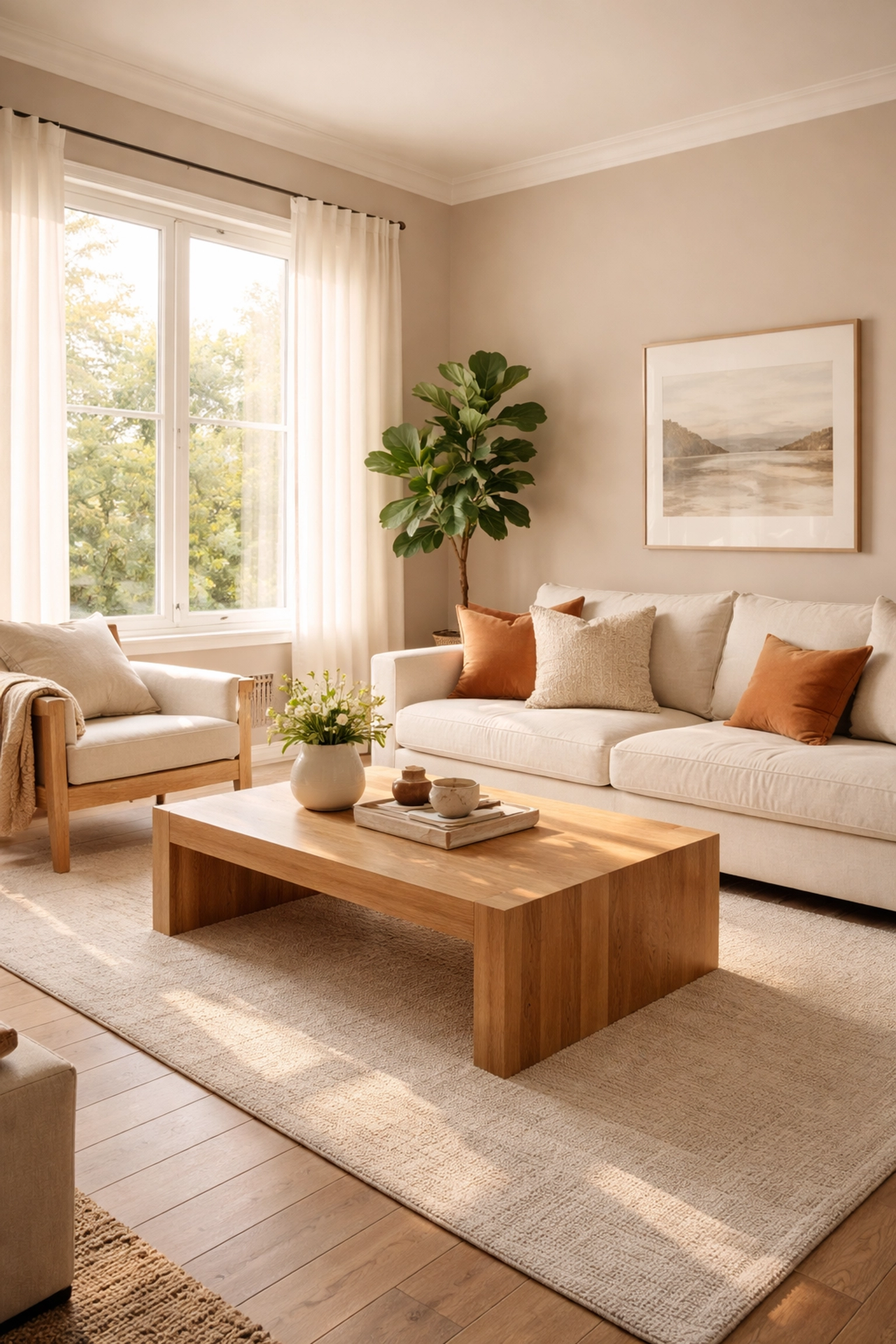
For Living Rooms and Common Areas
Benjamin Moore Revere Pewter remains a classic choice. This warm gray has just enough taupe to feel cozy without reading too dark. It pairs beautifully with both white trim and natural wood tones: perfect for Atlanta's many Craftsman and ranch-style homes.
Sherwin-Williams Malted Milk is another fantastic option. This peachy-pink neutral might sound bold, but it's incredibly subtle on the walls. It adds warmth without overwhelming and allows accent colors to shine.
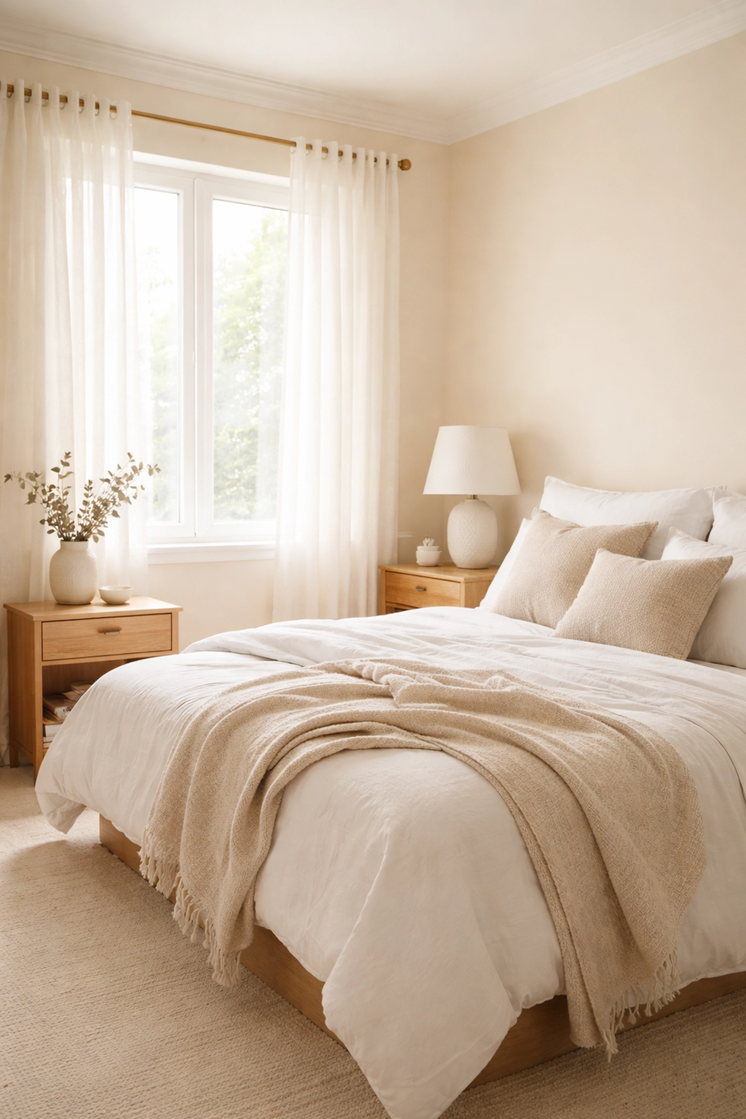
For Bedrooms and Bathrooms
Valspar Warm Eucalyptus is ideal for spaces where you want to unwind. Its muted gray-green tone encourages restoration and relaxation: exactly what you need after navigating Atlanta traffic.
Benjamin Moore Gentle Cream offers a softer approach. This warm cream creates a serene, spa-like atmosphere in bathrooms and a cozy cocoon in bedrooms.
For Kitchens and Dining Areas
Sherwin-Williams Natural Linen strikes the perfect balance between warm and clean. It's light enough to make smaller kitchens feel spacious but warm enough to make dining areas feel inviting.
Farrow & Ball Mouse's Back is a designer favorite for those wanting something with more depth. This color-shifting neutral can read as mushroom, green, or taupe depending on the light: creating visual interest throughout the day.
How Atlanta's Light Affects Your Color Choice
Here's something many homeowners don't consider: Atlanta's bright Southern light can dramatically change how a paint color looks on your walls. That perfect swatch you saw at the store? It might appear completely different in your home.
Warm neutrals tend to appear slightly deeper in our strong natural light. A color that looks like a soft cream in the showroom might read more golden in a south-facing Atlanta living room. This isn't a bad thing: it just means you need to test colors properly.
Check out our designer tips for more guidance on selecting colors that work with your home's specific lighting conditions.
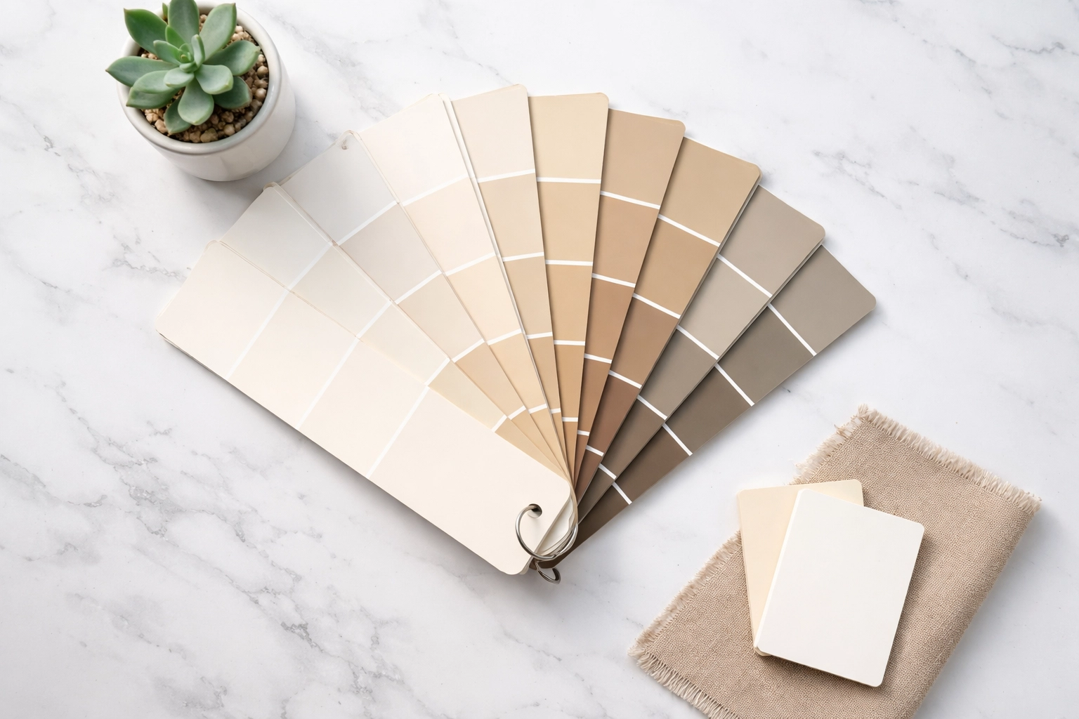
Tips for Testing Warm Neutral Paint Colors
Choosing paint colors can feel overwhelming, but these strategies will help you make a confident decision:
1. Get Large Samples
Those tiny paint chips don't tell the whole story. Purchase sample pots and paint large swatches (at least 12x12 inches) on your actual walls. Better yet, paint samples on poster board so you can move them around the room.
2. Observe at Different Times
Look at your samples in the morning, afternoon, and evening. Check them with your lights on and off. Warm neutrals can shift significantly depending on the light source.
3. Consider Your Existing Elements
Your paint color needs to work with your flooring, furniture, and fixed elements like kitchen counters or fireplace stone. Bring fabric swatches and flooring samples when you're picking colors.
4. Don't Forget Undertones
This is where many homeowners go wrong. A warm neutral might have pink, yellow, or orange undertones. Hold different options next to each other to see which undertone appeals to you most.
Matching Warm Neutrals to Atlanta Home Styles
Atlanta's diverse architecture means there's no one-size-fits-all approach. Here's how to match warm neutrals to common local home styles:
Traditional Southern Homes – Opt for creamy whites and soft taupes that honor the classic elegance of these homes. Benjamin Moore White Dove or Sherwin-Williams Accessible Beige work beautifully.
Mid-Century Modern – Don't be afraid of deeper warm neutrals like Glidden Warm Mahogany or earthy terracottas. These homes can handle bold, warm tones.
Contemporary/New Construction – Greige tones like Benjamin Moore Revere Pewter or Sherwin-Williams Agreeable Gray bridge the gap between modern and warm.
Craftsman Bungalows – These architectural gems shine with earthy neutrals that complement their natural woodwork. Sherwin-Williams Universal Khaki is an excellent choice.
Why Professional Application Matters
Even the most beautiful paint color can fall flat with poor application. Warm neutrals, in particular, require skill to apply evenly. Any inconsistency in the finish becomes more noticeable with these subtle shades.
When you're searching for a painter in Atlanta, look for a company with a proven track record. At Flawless Painting, we've been transforming Atlanta homes for 24 years. Our A+ BBB accreditation and satisfaction guarantee mean you can trust us to get the job done right.
We also use eco-friendly, low-VOC paints: important when you're painting interior spaces where your family lives and breathes. Plus, every crew has a dedicated team leader to ensure consistent quality from start to finish.
Don't just take our word for it. Check out our painting reviews to see what your neighbors are saying.
Making Your Decision
Choosing the right warm neutral for your Atlanta home comes down to three things:
- Your personal style – Do you prefer subtle creams or deeper taupes?
- Your home's lighting – How does natural and artificial light affect your space?
- Your existing elements – What colors are already locked in?
Take your time with this decision. A well-chosen warm neutral will serve as the perfect backdrop for your life for years to come.
Ready to Transform Your Space?
Warm neutrals are more than just a trend: they're a return to comfort, warmth, and creating spaces that truly feel like home. Whether you're drawn to the earthy elegance of Universal Khaki or the calming presence of Warm Eucalyptus, the right color is out there waiting for you.
When you're ready to bring your vision to life, our team at Flawless Painting is here to help. From color consultations to flawless application, we'll make sure your Atlanta home looks its absolute best.
Contact us today for a free estimate and let's create something beautiful together.